Every web developer knows about Flexbox. It's one of the most commonly used layout model in CSS and it works in a very intuitive way, right?
A Flexbox story
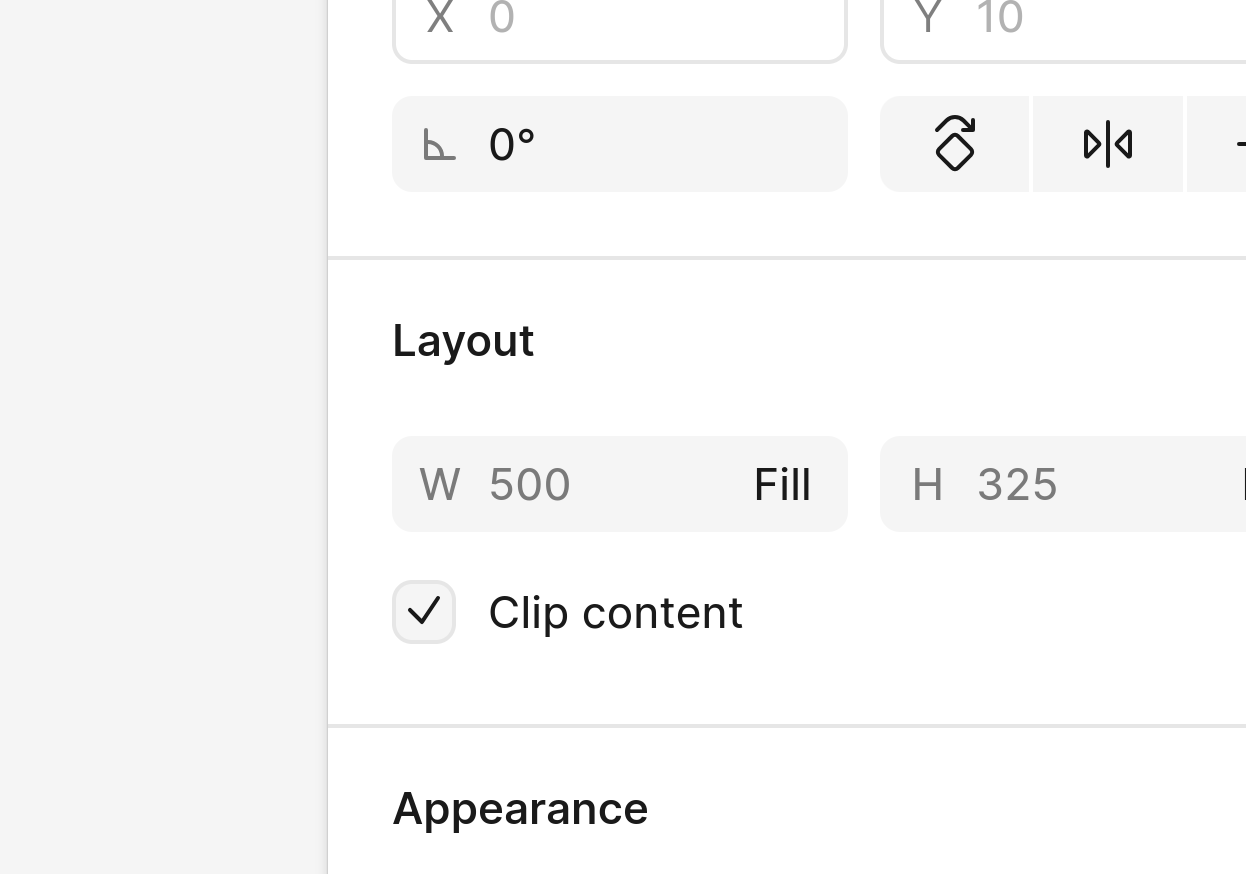
Recently, I was implementing a design from Figma which had two columns of the same size. The implementation in Figma was pretty simple: the container had a horizontal auto-layout, and each column width was set to Fill.

So I implemented this layout in CSS in a similar way, using display: flex on the container and flex: 1 on each column, and I went on styling each column separately. Sure enough, the columns ended up being of different size in the browser.
What??
Here is an example to try yourself.
<!DOCTYPE html>
<style>
  .container {
    display: flex;
    width: 200px;
  }

  .column {
    flex: 1 0 0;
    border: 5px solid red;
  }

  .more-styles {
    padding: 20px;
  }
</style>
<div class="container">
  <div class="column">...</div>
  <div class="column more-styles">...</div>
</div>
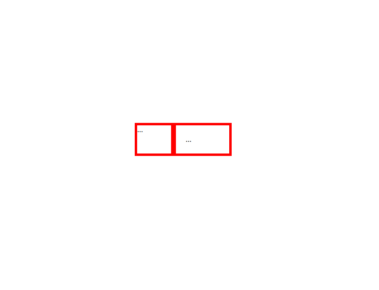
The right column has more padding, sure. But - I thought - the padding only affects the layout inside of a column, so surely it won't change its size.
I was wrong. The output looks something like this:

(I know what you're thinking. No, this has nothing to do with box-sizing, min-width or the actual content of the columns. It's a real effect.)
Learning how it works
So far so good. I was surprised, but apparently that's how the Flexbox work.
I wanted to learn more so I looked for a reference, but I couldn't find any mention of this effect on MDN. (I searched for half an hour, but maybe you can do a better job and actually find it!)
So, I decided to jump to the specs. I find the section called "Flex Layout Algorithm" and I'm greeted with this message:
This section is mainly intended for implementors. Authors writing web pages should generally be served well by the individual property descriptions, and do not need to read this section unless they have a deep-seated urge to understand arcane details of CSS layout.
(emphasis mine)
Indeed, this weird behavior with paddings is specified in that algorithm. But boy is it hard to find! I encourage the readers to go read that section and try and make sense of it.
Here is an excerpt just to get a feeling.
For every unfrozen item on the line, multiply its flex shrink factor by its inner flex base size, and note this as its scaled flex shrink factor. Find the ratio of the item’s scaled flex shrink factor to the sum of the scaled flex shrink factors of all unfrozen items on the line. Set the item’s target main size to its flex base size minus a fraction of the absolute value of the remaining free space proportional to the ratio. Note this may result in a negative inner main size; it will be corrected in the next step.
And, on top of that complexity, all browsers implement an algorithm which is slightly different from the specified one.
My take-home message
CSS is a powerful technology. It is very expressive (with a few properties you can build a layout that would be really hard to implement manually!) but it's also very opinionated.
Sometimes it's like magic, and it behaves exactly as you want after just adding a line. Sometimes it just won't listen, and can make you waste hours to debug your layouts.
Sure, the above examples is easy to fix. Just set the width to 50% and you're done. But what if we have 3 columns? Or what if the number changes dynamically? And there are a thousand examples like this one, where you have to go back and tweak your CSS because it didn't do what you meant.
CSS is powerful, and it's good that it is. Just remember that it way more complex than it looks.
Can Polipo help?
Polipo is based on a procedural algorithm that converts Figma designs to HTML and CSS. When possible, Polipo generates simple and lean CSS. However, in those cases where Figma and CSS use different layout algorithms, it will go the extra mile to make sure your layout is rendered pixel-perfect in the browser.
Since Polipo is a compiler, you don't have to edit the generated code to add functionality. This means that our code can focus on accuracy and performance, and we can handle all the edge cases for you.
Want to try Polipo?